高低の家 High and Low House 2009
三廊下の家 Three Corridors House 2011
内の家 House House 2013
茜の家 House in Madder Red 2015
A reframed space - the madder red room
The site sits on a higher side of a hill that gently climbs up from the Pacific Ocean near Katsuura, located in a region called Sotobo (Outer Boso Peninsula) in Chiba prefecture. The slope is not steep enough to make it a spectacular lookout point. The area has been developed for vacation homes with spacious lots. The local rule prohibits the fences, which makes the whole area look like a comfortably stretched residential quarter. In addition, as it is under a three-hour drive from Tokyo via TokyoWan Aqua-line (Trans Tokyo bay Expressway), its convenience has attracted a considerable number of retired people who decided to spend their remaining lives over here. As for my client, he has already retired from work, is enjoying an urban cultural life in Tokyo, and spending his hobby time as a ceramist in Chiba. The house has been planned as his second home.
The client didn’t ask too much: he wanted an atelier for his pottery making, a direct approach from his car to the entrance and his atelier without being wet in a rain, a calm inner environment rather than a good view, and three bedrooms. We offered 3 design plans, and he chose one which was very close to the finished design presented in this book. It was a rare experience that the client accepted our layout plan without much pondering.
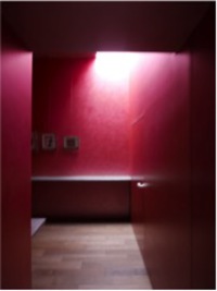
The key characteristic of the plan is that there is a large gallery next to the entrance, which is the hub of the traffic in the house. The plan has been made so that the residents frequently pass through this area when they move between the rooms. The entire gallery from the floor to the ceiling is painted in madder red which is also used on the coved ceiling of each room to create an effect as if the glow of sunset is filtering through the window. The gallery is especially impressive as the entire space is filled with madder red and the ceiling is very high. It has strong energy to refresh people’s senses when they enter the house or move between the rooms.
I have had a desire to bring about the re-freshening of the senses to people by way of architecture and urban design since the time I became an independent architect around the turn of the century. After a while, I began to think that a piece of architecture is merely a fixed physical object that shows the same look every day, and there are more dominant non-architectural objects such as plants, people, and skies in outer environment, and the dwellers and the pets inside the architecture. I wondered if a piece of architecture is like an open frame which dominant non-architectural elements are unexpectedly and whimsically framed in to give fresh surprises to the residents’ lives. This hypothesis led me to write a book titled “Architecture as Frame”. The idea still hasn’t changed basically, but there is another side of me that recognizes that the architecture has some influential power.
When reviewing each of the 3 houses I designed recently, I noticed that I had put a space that brings about a strong sensuous impact, just like the madder red gallery, in the hub area where the residents pass by when moving between the rooms. Putting it in an abstract way, I tried to give versatility to the architecture by creating discontinuity to the space. What descriptor should be given to this discontinuity? The house as a whole is like a frame, open to environments inside and outside, and maintaining various relationships with them. The space that creates the discontinuity, which sits in between the rooms, is isolated and independent from the other rooms, and acting as the center of gravity and the spiritual core of the house; if an entire house is a frame, it is re-framing the frame. Therefore, the space is a reframed space.
Let me provide brief descriptions of the 3 recent cases of the reframed space.
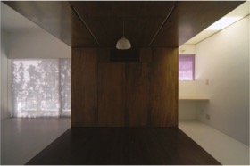
The first one is the “High Low House” completed in 2009. The house consists of 3 connected spaces of different types. The narrow corridor where lights pour down from the roof light (right side of the photo), the dark and low ceiling space (center of the photo), and the bright room with a high ceiling (left side of the photo). In this case, each space has distinctive character that creates discontinuity as a whole, and the space in the middle is the reframed space.
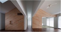
The second case is the ‘Three Corridors House’ completed in 2010. It has, as the name indicates, 3 corridors that span from the east side to the west side of the house, connecting 3 bedrooms, a tatami room, a study, a living room, a dining room, and the wet areas. Among the three, the central one has a high ceiling and creates a strong impression, hence the reframed space in this house.
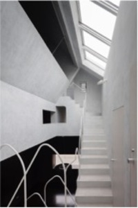
The last one is the “House House” completed in 2013. 4 individual rooms are laid out closely around a white void, and the residents inevitably walk through here when moving between the rooms. The white void is distinct from the black-colored hall underneath and the grey bedrooms adjacent to it, reframing the house. Similar to the 3 spaces described here, the madder red gallery featured in this book, located in the center of the house, is also a reframed space. The common characteristic of the 4 reframed spaces is, contrary to the concept of the house of “Architecture as Frame” which indicates openness, it is the space for reflection.
For the time being, I will try to balance the power of architecture itself and that of non-architectural things in my designing.